Make Your Designs Pop with a Color Scheme

Everybody knows the color wheel; we’ve been painting it since kindergarten. But how do we use it to choose our color scheme?
A color scheme is an arrangement or combination of colors and can be used in a variety of situations. Whether it’s for your company branding, an individual design project or even painting your living room, choosing colors that work well together can affect the success of your project.
There are plenty of color schemes that work well for these scenarios and more. Keep reading to learn about some of our favorites and how to make a color scheme that works for you.
Analogous
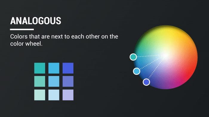
Analogous colors are ones that are next to each other on the color wheel. If your main color is an ocean blue, choosing colors like seafoam green and violet will help you create this type of color scheme. Because these colors are so close to one another, it helps establish a cohesive style.
Monochromatic
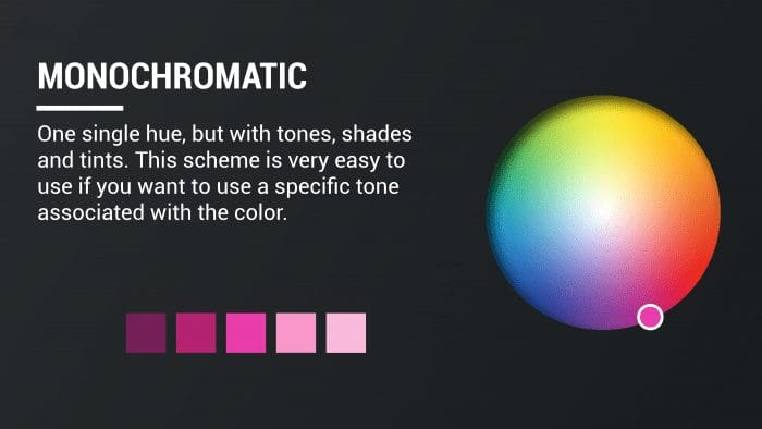
A monochromatic color scheme consists of one single hue, but with tones, shades and tints of that color. This scheme is very easy to use if you want to use a specific tone associated with the color. For example, a non-profit dedicated to raising money for breast cancer awareness may choose a monochromatic color scheme using shades of pink, like in the color scheme above.
Complementary
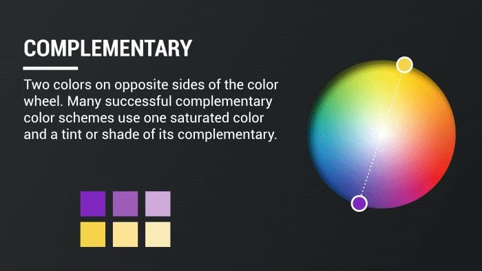
A complementary color scheme is made up of two colors on opposite sides of the color wheel. Many successful complementary color schemes use one saturated color and a tint or shade of its complementary, such as a rich purple and tint of yellow.
Triadic
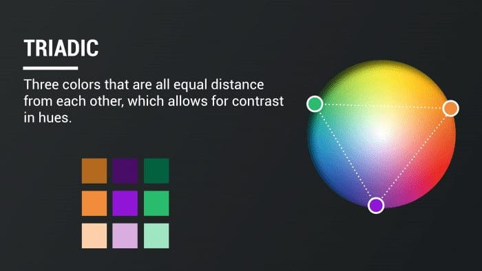
The prefix “tri” is associated with the word “three,” and that doesn’t change in a triadic color scheme. This color scheme is made up of three colors that are equidistant from each other, which allows for contrast in hues.
Split Complementary
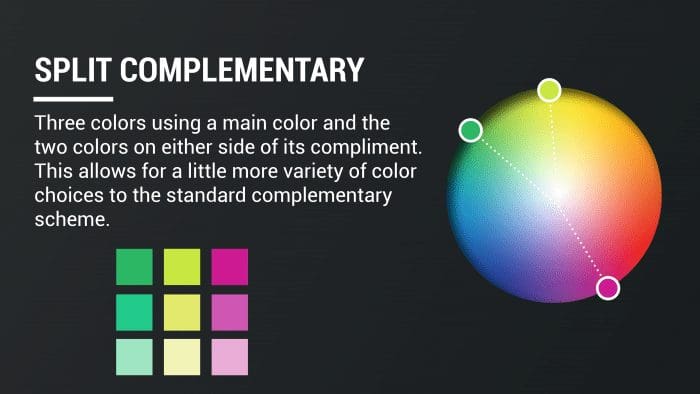
Like a triadic color scheme, a split complementary scheme also uses three colors. What makes it different is how the colors are selected. In a split complementary, the designer chooses a main color. The additional two colors are found on both sides of the main color’s complement. This allows for a little more variety of color choices to the standard complementary scheme.
Tetradic
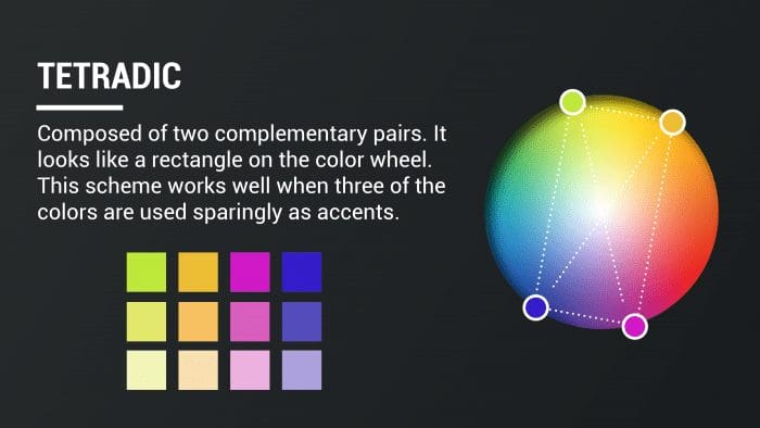
A tetradic color scheme is composed of two complementary pairs. When placed on the color wheel, it looks like a rectangle. This scheme works well when three of the colors are used sparingly as accents but can be overwhelming if each color is used equally and with the same intensity.
Impact’s Colors
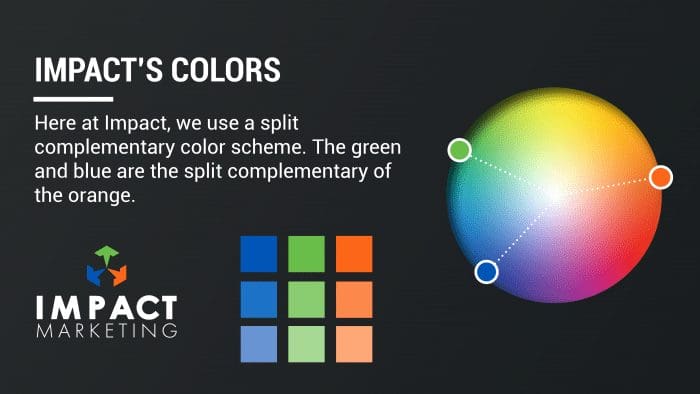
Here at Impact Marketing, we use a split complementary color scheme. The shades of green and blue are the split complementary of the orange shade, which is classified as the main color.
 Creating a Color Scheme
There are many resources online that allow you to create your own custom color scheme where you pick the main color, and the program finds the other colors based on what scheme you choose. You can then adjust as needed. Two resources we recommend are Adobe Color and Paletton.
A more organic way to get a color scheme is from your favorite photograph. This can be helpful if you already have a few photographs or a mood board in mind. You can do it manually using the eyedrop tool in your favorite design software, or you could go online. At icolorpalette.com, you can upload an image of your choice and the program will automatically choose five colors. (Don’t worry, you can manually change specific colors until you are satisfied.)
Here at Impact Marketing, our graphic designers are experts when it comes to color and all things design related. Trust us with your graphic design needs and give us a call at 319-232-4332 or visit us at impactmt.com.
Resources:
https://www.g2.com/articles/color-schemes
https://color.adobe.com/create/color-wheel
https://paletton.com/#uid=1000u0kllllaFw0g0qFqFg0w0aF


