Susan Kare: A Pioneer in Graphic Design

Every March, we celebrate Women’s History Month with a theme. This year’s theme is “Celebrating Women Who Tell Our Stories” to recognize women in all forms of media, storytelling, news and art. In honor of Women’s History Month, we would like to highlight Susan Kare, a famous female graphic designer responsible for much of the original user interface design work we see today.
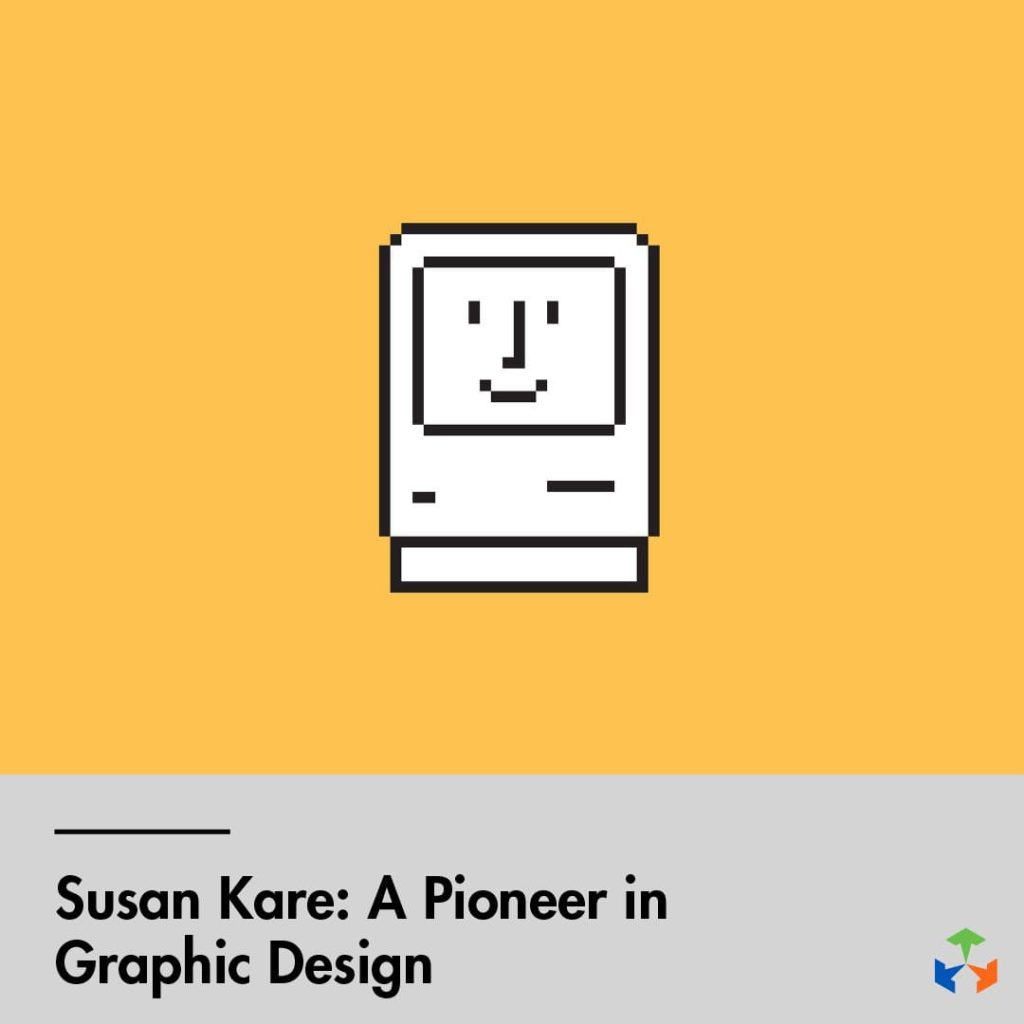
Kare earned her Ph.D. in Fine Arts from New York University in 1978. Early in her career she worked for Apple, then NeXT Computer with Steve Jobs. Later, she started her own graphics studio (with clients such as IBM, Facebook and Sony Pictures) and later became the Creative Director at Pinterest. Most people have probably interacted with her work without knowing or thinking about how it was designed. Her work is celebrated as a pioneer for pixel art.
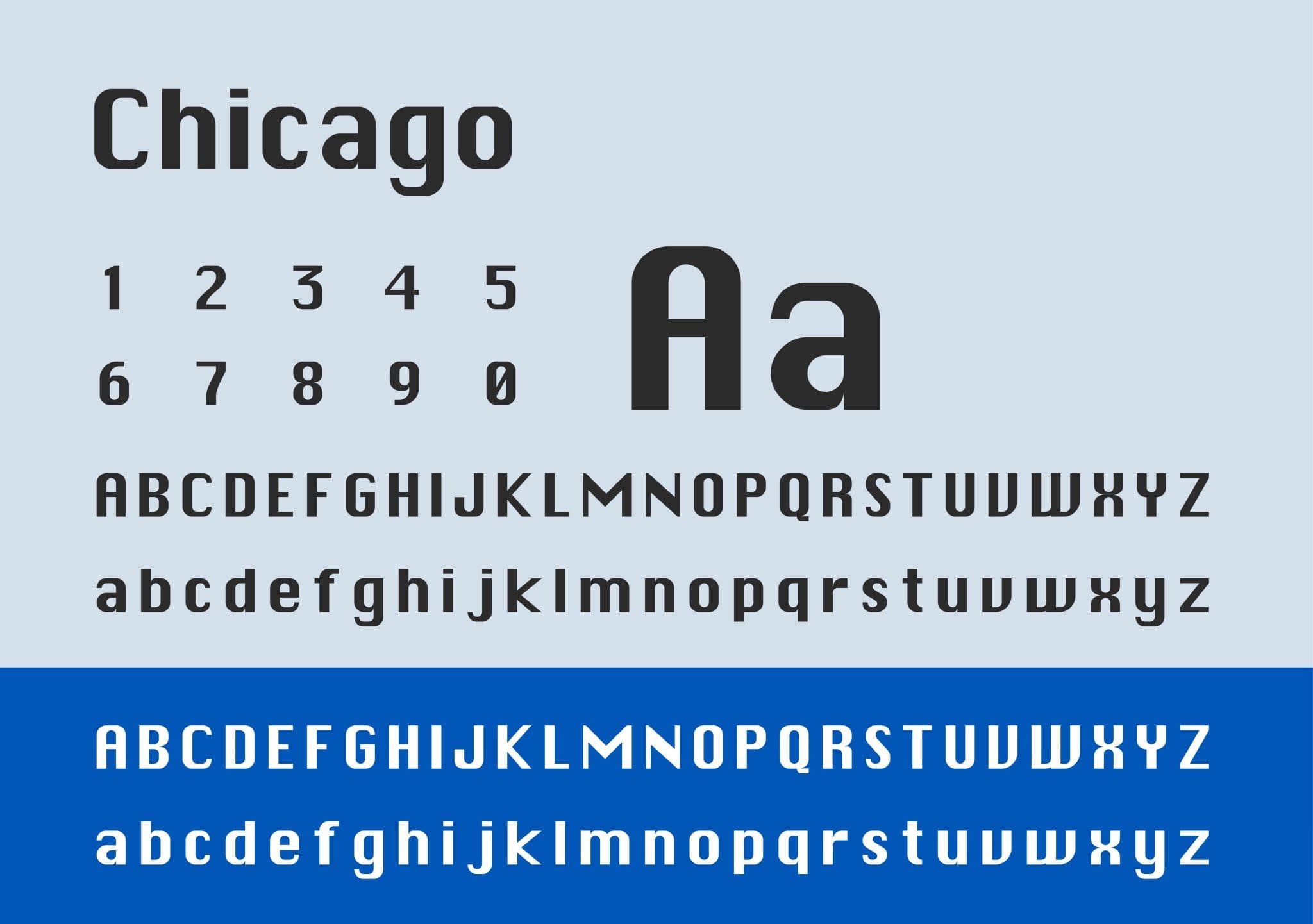
Chicago Typeface
Chicago typeface was designed in 1984 by Susan Kare for Apple to use in their interface design and brand. Chicago is a heavy sans-serif font in a bitmap style (originally named Elefont). The design was created with readability in mind. The font was the world’s first proportionally spaced digital font family and was made specifically for the low-resolution screens of the time. It was used throughout Apple’s computer interface consistently until Mac OS 8. Chicago was then replaced with Charcoal (a typeface designed based off Chicago) in 1997. Many people will recognize Chicago as the font used for early iPods. Kare also created New York and San Francisco typefaces for Macintosh.

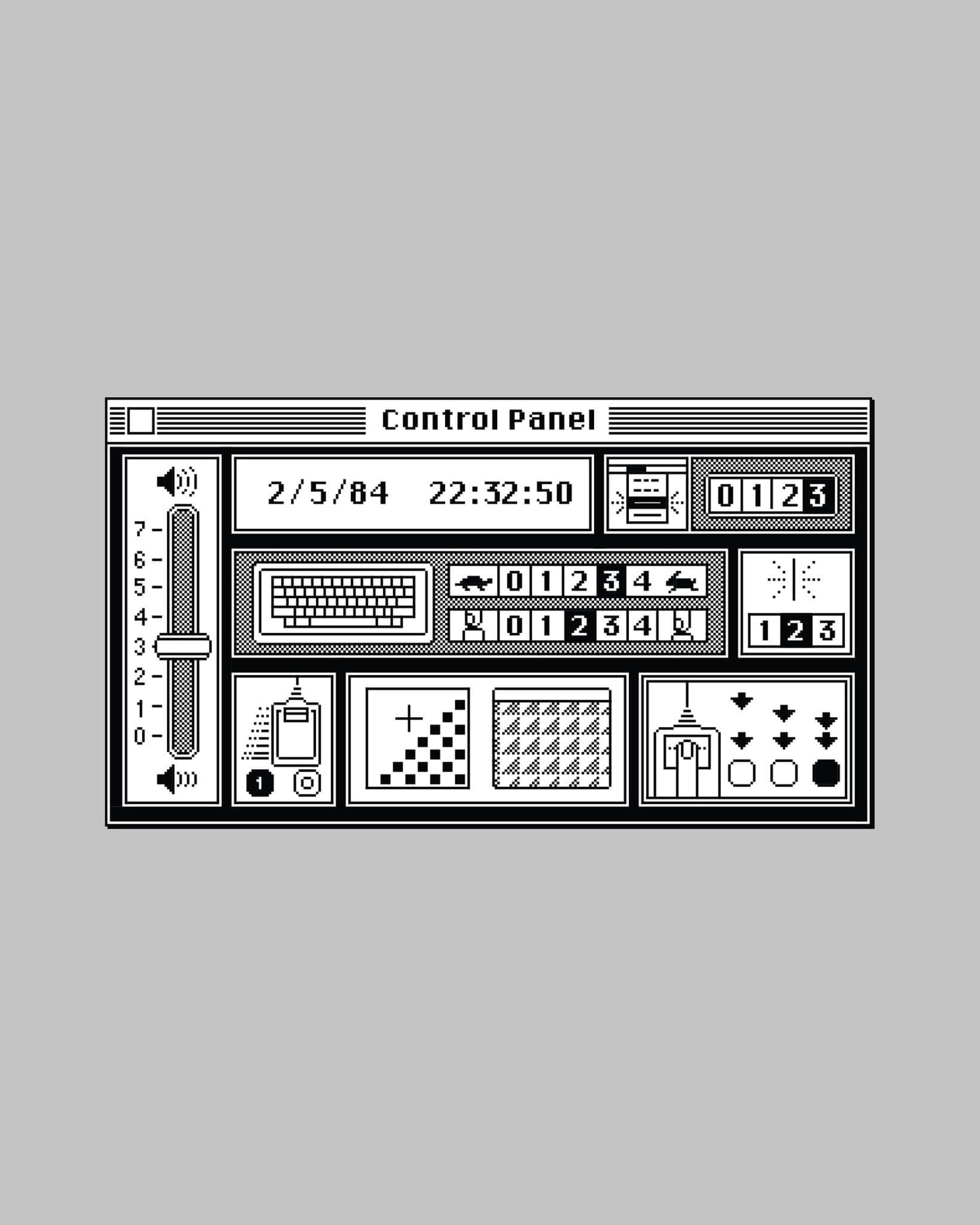
Interface Design
When Kare worked as a user interface designer, she started with grid paper to represent pixels while sketching the icons for NeXT. Her goal was to create icons that everyone could easily understand.
“An icon is successful if you could tell someone what it is once and they don’t forget it… the best icons are more like traffic signs than graphic illustrations” Kare stated.
Hundreds of icons together created an interface for Windows 3.0 that led interface designers to think about the human using the computer. Some of Kare’s icons that are still used today that are largely un-changed include: Command Symbol, Lasso and Paint Bucket. Many do not know that she also designed the iconic solitaire game that came with Windows 3.0.
Many of her interface designs are on display in Modern Art Museums across the country, including her original sketchbook. To view more of her work check out her portfolio at: https://www.behance.net/susankare/projects.
![]()

Photo source: https://www.behance.net/susankare/projects
Impact Marketing has hardworking graphic designers and developers with design backgrounds ready to bring your ideas to life. Give us a call at 319-232-4332 or visit us at impactmt.com.
References:
https://www.chicagomag.com/city-life/september-2018/chicago-the-typeface/
https://www.nytimes.com/1996/08/26/business/the-designer-who-made-the-mac-smile.html


