Simple Logo Usage Rules to Follow

Having a great logo for your new business is enough, right? It looks great and matches your business’ mission. Now all you need to do is throw it on your products and marketing materials and call it a day, right? You’re close, but not done yet. You also need to know how to display it correctly.
Displaying your business’s logo correctly is key to expressing your message consistently and clearly across all visual mediums. Incorrect use could actually hurt you. Keeping your logo the same will increase its recognizability, and, therefore, your reach to customers.
Key logo rules to follow:
Clear space
Respect the bubble. Your logo loves space. It needs it to breathe. Make sure elements (such as headlines or busy backgrounds) aren’t too close to your logo. Remember, you want people to see it!
For the Cedar Valley OrthoAgility Center, we established that the clear space should be the same size as the “C” in “Center”. That means that the logo needs to be at least that amount of space away from edges and other elements.
 Color
Color
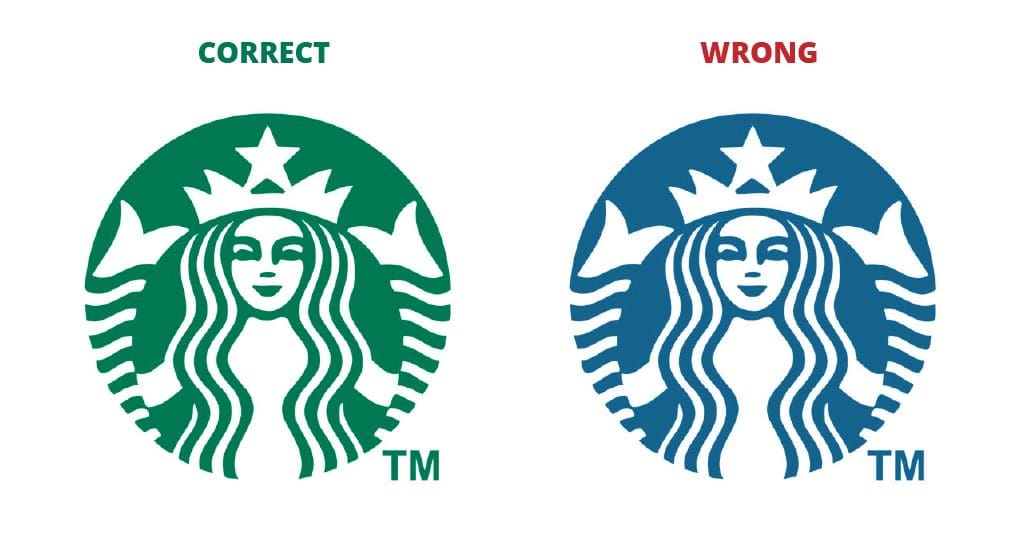
Your logo likes the color it is. Don’t change it, don’t alter it, and make sure that it is the exact color outlined in your company’s style guide. You wouldn’t trust a blue Starbucks because it is different from what you know. Just like that, your clients won’t trust your logo if it doesn’t match.

Background
Often, a logo variation will be approved for use on backgrounds that the original logo will look bad on. To prevent this, the designer will say in a branding style guide exactly what variation to use. Here, we have an all-white version of Impact’s logo for backgrounds that are dark or high in saturation.

Logos can’t be placed on busy backgrounds. If you must squint to see the logo, don’t put it there. Plan the graphic so that the logo sits on a solid field, such as the plain blue sky of a photo, rather than in the trees.
Variations
Different mediums often mean that different logo treatments will have more success. A social media profile picture is a circle or square, and often just the icon is enough, as your company’s name is on the account already. (Be careful when cropping inside the social media platform. It will sometimes cut off your icon. Remember to leave enough space around the edges.)
Other times, you might need a vertical variation of your logo when the horizontal one doesn’t quite fit. Make sure you only use the approved variations instead of recreating it.
 It’s not just your logo that needs specific attention when designing – other branding elements your company uses need it as well. Whether it’s a slogan, icon or background, the treatment for those elements needs the same amount of attention that the logo receives. and often, the rules for those overlap. Your slogan should be easily read on a plain background. The colors of your website icons should stay consistent.
Another thing to keep in mind is that logo usage guidelines are often illustrated in your company’s branding style guide, along with type treatment and brand colors. Don’t have a branding style guide? Hire a marketing company to make one for you! A designer will be able to create a custom style guide and logo rules that work specifically for your business to help you be successful.
Whether you are a new business or due for a rebrand, you need a logo that represents your company. Here at Impact Marketing, we have a whole team of experts ready to brainstorm ideas, sketch logos, and create a whole branding style guide for you. Give us a call at 319-232-4332 or visit us at impactmt.com.


