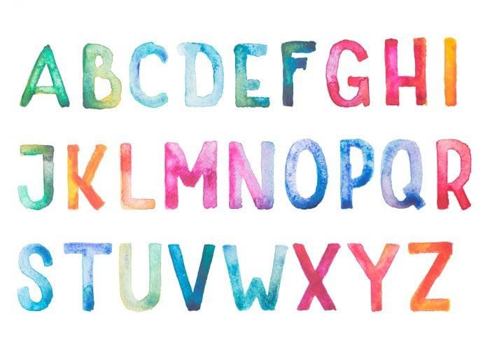
Font Psychology: How your Words Look Matters

Font (noun)
An assortment or set of type or characters all of one style and sometimes one size.
That’s the definition of font according to Merriam-Webster. When used with other elements in design, font does an excellent job of conveying different feelings or purposes.

Associated with tradition and reliability, serif fonts are identified by the “tails,” or seifs on the ends of letters. Typically, it conveys a timeless, sometimes formal, aura. The tails can also aid in reading and may guide the reader from one letter to the other quicker, making it an excellent choice for printed blocks of text.
When to Use: Logo design, body copy, titles or small text
Common Serif Fonts: Times New Roman, Georgia, Baskerville & Didot

Sans serif fonts are commonly called the most neutral font style because of its lack of identifying characteristics. Despite that, it is also associated with modern design because of its open and geometric style and is typically used in online design.
When to Use: Logo design, body copy, titles or small text
Common Sans Serif Fonts: Avenir, Futura, Helvetica & Verdana

An easily readable font with subtle decorative elements, slab serif fonts are an impactful variation on the traditional serif font. The serifs on these fonts are blocky with little to no variation depending on the letter. Use it when you need something more traditional than a sans serif font but more modern than the traditional serif.
When to Use: Logo design or titles
Common Slab Serif Fonts: Rockwell, Adelle, Clarendon & Archer

Easily the most elegant style of font, script fonts are excellent choices for formal event marketing. However, since script fonts are more complex and have several elements in each letter, it can be very difficult to read in large amounts of text.
When to Use: Logo design, titles or invitations
Common Script Fonts: Edwardian, Snell Roundhand, & Zapfino

Handwritten fonts are a more casual subcategory of script fonts. These are also more personal than other font types and evoke similar feelings as a handwritten letter or note. Handwritten fonts can make the audience feel a personal attachment to the brand or design.
When to Use: Logo design, titles or invitations
Common Handwritten Fonts: Freestyle Script, Handwritten & Dancing Script
Sources:
https://www.typewolf.com/top-10-slab-serif-fonts
https://digitalsynopsis.com/design/font-psychology-emotions/
https://www.nickkolenda.com/font-psychology/#fonts-p2-t4


