

Case Study Details
The Problem
To begin an advertising campaign, you must first find the problem. Only then can you work towards a solution.
When buying from an insurance company, it’s very common that you choose a company based on the account manager as opposed to the actual plan. After two longtime benefit consultants left the company, Fortress brought in two new consultants who expressed interest in rebranding the currently blocky website to a cleaner, more modern look.
- Market: Rural Iowa
- Project: Website Design & Development, Logo & Branding
-
Start Date:
March 2019 [Branding]
June 2021 [Website] -
End Date:
April 2019 [Branding]
August 2021 [Website]
Services Provided
Here are some of the main services Impact Marketing provided for the campaign.
We combine your goals and objectives with our knowledge and experience to create a specific plan of attack for your online strategy. At Impact, we believe that your campaign should be the focalized center of your brand.

Website Design & Development

Logo Design

Branding Guidelines

Custom Animations
Project Details
Our Process
Every Campaign has its trial to success. Learn about how we conquered ours with thorough research and strategy.
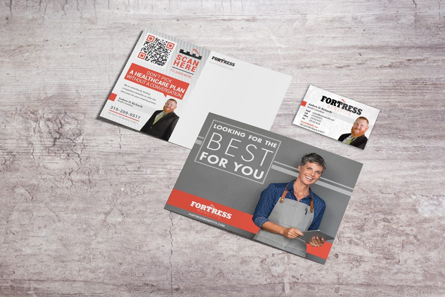
- Earlier in our partnership, Impact Marketing designed a new logo for Fortress Benefits. This design married light and heavy fonts that used the colors orange and black. Additionally, the “T” in “Fortress” mimicked the appearance of a tower, which helped make the design recognizable. Knowing that the logo was an essential part of the Fortress brand, our web development team took inspiration from it when working on the design for the new site.
- Every website begins with a design comp that consists of a header, footer and home page design. This establishes the website’s outline in addition to showing elements (such as colors, fonts, etc.) that will be present throughout the entire site. This can include client-provided content as well.
- Once the first design was completed, our team met with the client to discuss the overall look and feel of the website. After a few website additions, such as a social media feed and testimonial videos, our team started development, which included animating the site’s graphics.
The Imagery
The eyes capture things that draw our attention. That is why we use branding and strong visuals to draw the user in.
Because Fortress Benefit’s logo uses the orange accent color sparingly, we decided to make that color the focal point of their website. Using shades of orange, white and gray created a light and airy website that complimented the client’s established brand.
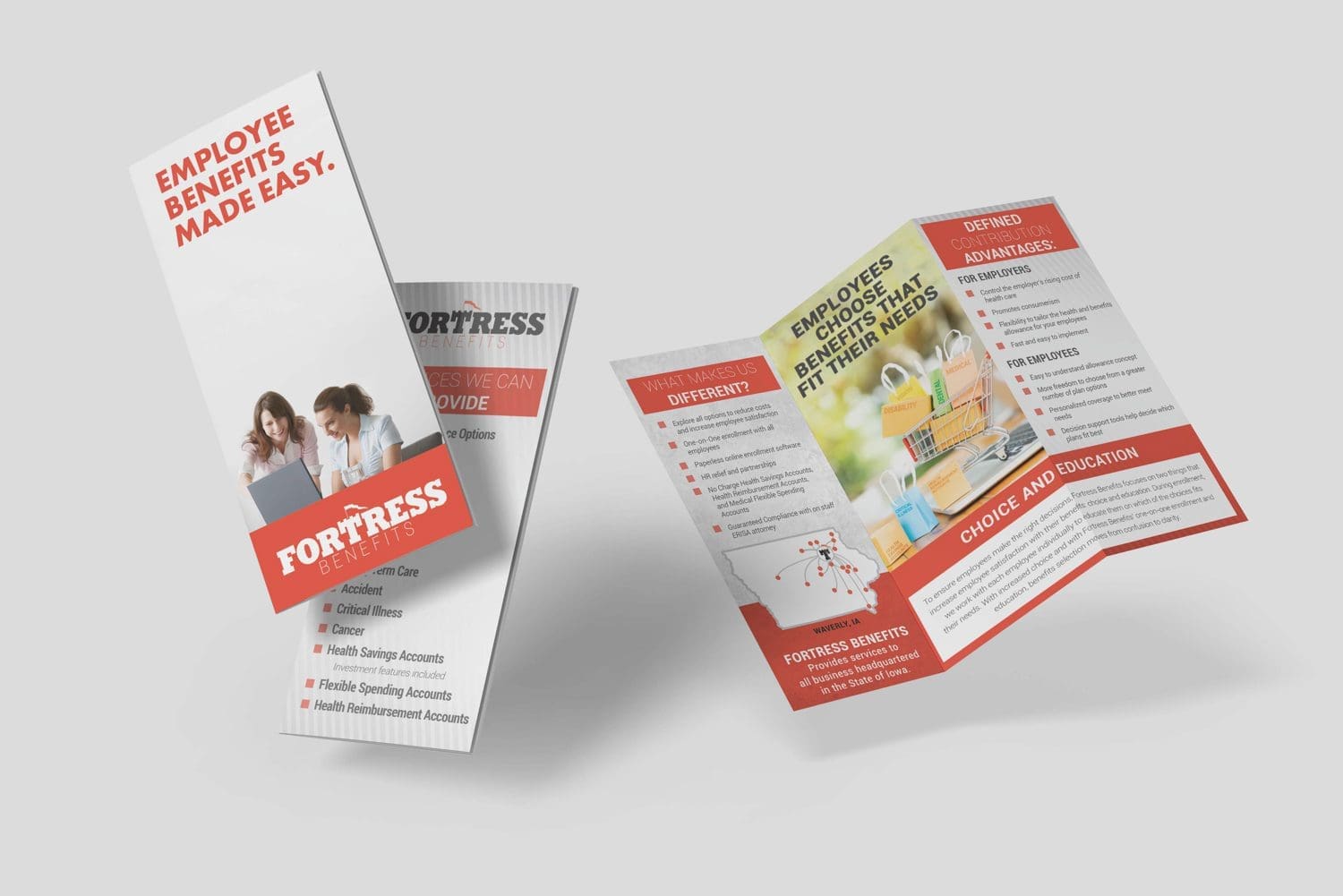
Additionally, our team decided to utilize custom infographics on this website. Infographics are a useful tool to explain complex procedures or topics and work well on fluid designs, as they utilize negative space effectively. Some of these designs were then animated to create heightened viewer interest.


The Final Result
How our approach reached Fortress Benefit’s goal as a company.
Information-based websites are oftentimes blocky, uninviting and overwhelming for the viewer. We acknowledged these problems and met them head-on with this website. The effective use of spot color, white space and infographics allows the audience to view the website effectively on all devices. Because our client provided valuable feedback throughout the process, we were able to add features important to them without sacrificing the user-friendly design.